
Businesses need websites to establish their presence in the digital world. It is not enough to just have a website but it’s also imperative that your website is responsive and adaptable in the changing times.
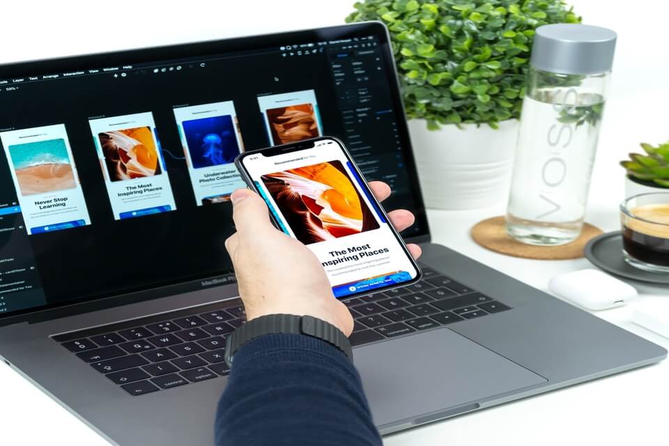
Many people are using their smartphones and mobile devices to access websites, that’s why responsive websites are the standard. Aside from a better user interface and experience and SEO optimization, the responsive web design helps to improve the overall customer experience.
Responsive web design is an approach where design and development prioritize user behavior and environment based on screen size, orientation, and platform. This method adjusts the web layout so the website can “shrink to fit” on screens of any device.
This approach features a combination of flexible layouts and images. It also features a brilliant usage of CSS media queries. When a user switches from different devices, websites should be adjusted to the resolution, image size, and etc.
Types of Responsive Web Design Layouts
Responsive websites need technology to automatically respond according to the preferences of their users regardless of the device they were using. Generally, there are three responsive web design layouts: Responsive, Adaptive, and Fluid.
Responsive Web Design
First on the list is the Responsive Web Design (RWD) layout. This kind of design layout uses media queries to target breakpoints that scale images, wrap texts, and adjust layouts to shrink and fit any size of the screen. RWD gives an easier look and feel on a website which would ensure a better user experience for potential customers.
Google recommends and favors this type of web design layout. Since they constantly release algorithm updates, the search engine is leaning towards mobile-friendly websites in determining search rankings.
Adaptive Web Design
Adaptive Web Design (AWD) layout uses CSS media queries to identify the specific device sizes for websites to deliver the site’s optimised version. It gets the particular static layout once it determines the screen size where the website was accessed.
AWD is beneficial since it helps you in identifying which is the most appropriate resolutions and options for the website layout. There are six adaptive web design layouts to choose from which could drive more traffic to your website.
Typically, the Adaptive Web Design (AWD) layout is effective for websites that would like to change for a newer look and it prioritises saving time and money by allocating your efforts to your top priorities.
Fluid Web Design
And the last responsive web design layout we are discussing in this article is the Fluid Web Design (FWD).
This type of web design layout offers the same adaptability of responsive and adaptive sites. But unlike the two other layouts, it does not really rely on fixed units.
Alternatively, it utilizes the percentage of space as a measurement point. This way, it could scale in any device you are using. With FWD, you can expect a better, more natural customer experience because you are adapting your layout in consideration of your prospects.
Fluid Web Design offers its fluidity, whitespace flexibility and user-friendliness of the overall layout.
Creating websites that have good responsive web design layouts improve the user interface and user experience which ultimately impacts the overall customer experience of your brand. If you’re looking for a reliable web designer to help you develop a responsive website for your business, go for Flexisource IT.
Flexisource IT is your partner in innovation, building you reliable, fully-managed IT teams from top-calibre experts in the Philippines. Our flexible outsourcing or flexisourcing staff augmentation model helps brands personalize teams according to your needs.


